
Je cherche à "couper" le coin supérieur gauche d'un div, comme si vous aviez plié le coin d'une page vers le bas.
J'aimerais le faire en pure CSS, y a-t-il des méthodes ?
Je cherche à "couper" le coin supérieur gauche d'un div, comme si vous aviez plié le coin d'une page vers le bas.
J'aimerais le faire en pure CSS, y a-t-il des méthodes ?
Une autre idée consiste à utiliser un masque et des variables CSS pour mieux contrôler l'ensemble de la forme. C'est réponsif, transparent et permet tout type de fond :
.box {
  --all:0px;
  width:200px;
  height:150px;
  display:inline-block;
  margin:10px;
  background:red;
  -webkit-mask:
     linear-gradient(  45deg, transparent 0 var(--bottom-left,var(--all)) ,#fff 0) bottom left,
     linear-gradient( -45deg, transparent 0 var(--bottom-right,var(--all)),#fff 0) bottom right,
     linear-gradient( 135deg, transparent 0 var(--top-left,var(--all))    ,#fff 0) top left,
     linear-gradient(-135deg, transparent 0 var(--top-right,var(--all))   ,#fff 0) top right;
   -webkit-mask-size:50.5% 50.5%;
   -webkit-mask-repeat:no-repeat;
}

body {
  background:grey;
}

<div class="box" style="--top-left:20px"></div>
<div class="box" style="--top-right:20px;--bottom-right:50px;background:radial-gradient(red,yellow)"></div>
<div class="box" style="--all:30px;background:url(https://picsum.photos/id/104/200/200)"></div>
<div class="box" style="--all:30px;--bottom-right:0px;background:linear-gradient(red,blue)"></div>
<div class="box" style="--all:50%;width:150px;background:green"></div>
<div class="box" style="--all:12%;width:150px;background:repeating-linear-gradient(45deg,#000 0 10px,#fff 0 20px)"></div>
Et ci-dessous, au cas où vous voudriez envisager la frontière :
.box {
  --all:0px;
  --b:pink;

  width:200px;
  height:150px;
  display:inline-block;
  margin:10px;
  border:5px solid var(--b);
  background:
     linear-gradient(  45deg, var(--b) 0 calc(var(--bottom-left,var(--all)) + 5px) ,transparent 0) bottom left /50% 50%,
     linear-gradient( -45deg, var(--b) 0 calc(var(--bottom-right,var(--all)) + 5px),transparent 0) bottom right/50% 50%,
     linear-gradient( 135deg, var(--b) 0 calc(var(--top-left,var(--all)) + 5px)    ,transparent 0) top left    /50% 50%,
     linear-gradient(-135deg, var(--b) 0 calc(var(--top-right,var(--all)) + 5px)   ,transparent 0) top right   /50% 50%,
     var(--img,red);
  background-origin:border-box;
  background-repeat:no-repeat;
  -webkit-mask:
     linear-gradient(  45deg, transparent 0 var(--bottom-left,var(--all)) ,#fff 0) bottom left,
     linear-gradient( -45deg, transparent 0 var(--bottom-right,var(--all)),#fff 0) bottom right,
     linear-gradient( 135deg, transparent 0 var(--top-left,var(--all))    ,#fff 0) top left,
     linear-gradient(-135deg, transparent 0 var(--top-right,var(--all))   ,#fff 0) top right;
   -webkit-mask-size:50.5% 50.5%;
   -webkit-mask-repeat:no-repeat;
}

body {
  background:grey;
}

<div class="box" style="--top-left:20px"></div>
<div class="box" style="--top-right:20px;--bottom-right:50px;--img:radial-gradient(red,yellow);--b:white;"></div>
<div class="box" style="--all:30px;--img:url(https://picsum.photos/id/104/200/200) center/cover;--b:orange;"></div>
<div class="box" style="--all:30px;--bottom-right:0px;--img:linear-gradient(red,blue)"></div>
<div class="box" style="--all:50%;width:150px;--img:green;--b:red;"></div>
<div class="box" style="--all:12%;width:150px;--img:repeating-linear-gradient(45deg,#000 0 10px,#fff 0 20px)"></div>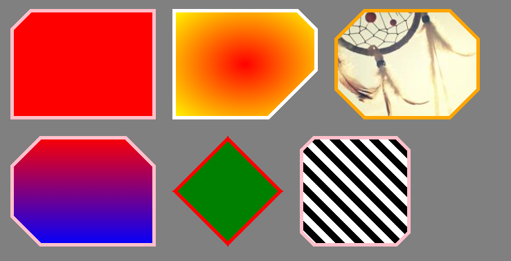
Ajoutons également un peu de rayon :
.box {
  --all:0px;
  --b:pink;

  width:200px;
  height:150px;
  display:inline-block;
  margin:10px;
  filter:url(#round);
}
.box::before {
  content:"";
  position:absolute;
  top:0;
  left:0;
  right:0;
  bottom:0;
  background:var(--img,red);
  -webkit-mask:
     linear-gradient(  45deg, transparent 0 var(--bottom-left,var(--all)) ,#fff 0) bottom left,
     linear-gradient( -45deg, transparent 0 var(--bottom-right,var(--all)),#fff 0) bottom right,
     linear-gradient( 135deg, transparent 0 var(--top-left,var(--all))    ,#fff 0) top left,
     linear-gradient(-135deg, transparent 0 var(--top-right,var(--all))   ,#fff 0) top right;
   -webkit-mask-size:50.5% 50.5%;
   -webkit-mask-repeat:no-repeat;
}

body {
  background:grey;
}

<div class="box" style="--top-left:20px"></div>
<div class="box" style="--top-right:20px;--bottom-right:50px;--img:radial-gradient(red,yellow);--b:white;"></div>
<div class="box" style="--all:30px;--img:url(https://picsum.photos/id/104/200/200) center/cover;--b:orange;"></div>
<div class="box" style="--all:30px;--bottom-right:0px;--img:linear-gradient(red,blue)"></div>
<div class="box" style="--all:50%;width:150px;--img:green;--b:red;"></div>
<div class="box" style="--all:12%;width:150px;--img:repeating-linear-gradient(45deg,#000 0 10px,#fff 0 20px)"></div>

<svg style="visibility: hidden; position: absolute;" width="0" height="0" xmlns="http://www.w3.org/2000/svg" version="1.1">
  <defs>
        <filter id="round">
            <feGaussianBlur in="SourceGraphic" stdDeviation="5" result="blur" />
            <feColorMatrix in="blur" mode="matrix" values="1 0 0 0 0  0 1 0 0 0  0 0 1 0 0  0 0 0 19 -9" result="goo" />
            <feComposite in="SourceGraphic" in2="goo" operator="atop"/>
        </filter>
    </defs>
</svg>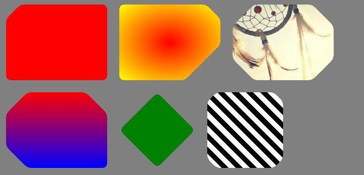
Ce code vous permet de couper les coins de chaque côté du rectangle :
div {
  display:block;
  height: 300px;
  width: 200px;
  background: url('http://lorempixel.com/180/290/') no-repeat;
  background-size:cover;

  -webkit-clip-path: polygon(10px 0%, calc(100% - 10px) 0%, 100% 10px, 100% calc(100% - 10px), calc(100% - 10px) 100%, 10px 100%, 0% calc(100% - 10px), 0% 10px);
  clip-path: polygon(10px 0%, calc(100% - 10px) 0%, 100% 10px, 100% calc(100% - 10px), calc(100% - 10px) 100%, 10px 100%, 0% calc(100% - 10px), 0% 10px);
}
http://jsfiddle.net/2bZAW/5552/
Merci. Savez-vous comment cette solution affecte les performances ? Elle semble un peu lourde.
Si vous avez besoin d'une bordure diagonale au lieu d'un coin diagonal, vous pouvez empiler 2 divs dont chacun est un pseudo-élément :
DEMO
http://codepen.io/remcokalf/pen/BNxLMJ
.container {
  padding: 100px 200px;
  overflow: hidden;
}

div.diagonal {
  background: #da1d00;
  color: #fff;
  font-family: Arial, Helvetica, sans-serif;
  width: 300px;
  height: 300px;
  padding: 70px;
  position: relative;
  margin: 30px;
  float: left;
}

div.diagonal2 {
  background: #da1d00;
  color: #fff;
  font-family: Arial, Helvetica, sans-serif;
  width: 300px;
  height: 300px;
  padding: 70px;
  position: relative;
  margin: 30px;
  background: #da1d00 url(http://www.remcokalf.nl/background.jpg) left top;
  background-size: cover;
  float: left;
}

div.diagonal3 {
  background: #da1d00;
  color: #da1d00;
  font-family: Arial, Helvetica, sans-serif;
  width: 432px;
  height: 432px;
  padding: 4px;
  position: relative;
  margin: 30px;
  float: left;
}

div.inside {
  background: #fff;
  color: #da1d00;
  font-family: Arial, Helvetica, sans-serif;
  width: 292px;
  height: 292px;
  padding: 70px;
  position: relative;
}

div.diagonal:before,
div.diagonal2:before {
  content: '';
  position: absolute;
  top: 0;
  left: 0;
  border-top: 80px solid #fff;
  border-right: 80px solid transparent;
  width: 0;
}

div.diagonal3:before {
  content: '';
  position: absolute;
  top: 0;
  left: 0;
  border-top: 80px solid #da1d00;
  border-right: 80px solid transparent;
  width: 0;
  z-index: 1;
}

div.inside:before {
  content: '';
  position: absolute;
  top: -4px;
  left: -4px;
  border-top: 74px solid #fff;
  border-right: 74px solid transparent;
  width: 0;
  z-index: 2;
}

h2 {
  font-size: 30px;
  line-height: 1.3em;
  margin-bottom: 1em;
  position: relative;
  z-index: 1000;
}

p {
  font-size: 16px;
  line-height: 1.6em;
  margin-bottom: 1.8em;
}

#grey {
  width: 100%;
  height: 400px;
  background: #ccc;
  position: relative;
  margin-top: 100px;
}

#grey:before {
  content: '';
  position: absolute;
  top: 0;
  left: 0;
  border-top: 80px solid #fff;
  border-right: 80px solid #ccc;
  width: 400px;
}

<div id="grey"></div>
<div class="container">
  <div class="diagonal">
    <h2>Header title</h2>
    <p>Yes a CSS diagonal corner is possible</p>
  </div>
  <div class="diagonal2">
    <h2>Header title</h2>
    <p>Yes a CSS diagonal corner with background image is possible</p>
  </div>
  <div class="diagonal3">
    <div class="inside">
      <h2>Header title</h2>
      <p>Yes a CSS diagonal border is even possible with an extra div</p>
    </div>
  </div>
</div>
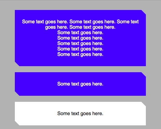
Nous avions le problème des différentes couleurs de fond pour nos éléments découpés. Et nous ne voulions que les coins supérieurs droits et inférieurs gauches.
body {
 background-color: rgba(0,0,0,0.3)

}

.box {
 position: relative;
 display: block;
 background: blue;
 text-align: center;
 color: white;
 padding: 15px;
 margin: 50px;
}

.box:before,
.box:after {
 content: "";
 position: absolute;
 left: 0;
 right: 0;
 bottom: 100%;
 border-bottom: 15px solid blue;
 border-left: 15px solid transparent;
 border-right: 15px solid transparent;
}

.box:before{
    border-left: 15px solid blue;
}

.box:after{
    border-right: 15px solid blue;
}

.box:after {
 bottom: auto;
 top: 100%;
 border-bottom: none;
 border-top: 15px solid blue;
}

/* Active box */
.box.active{
    background: white;
    color: black;
}

.active:before,
.active:after {
 border-bottom: 15px solid white;
}

.active:before{
    border-left: 15px solid white;
}

.active:after{
    border-right: 15px solid white;
}

.active:after {
 border-bottom: none;
 border-top: 15px solid white;
}

<div class="box">
 Some text goes here. Some text goes here. Some text goes here. Some text goes here.<br/>Some text goes here.<br/>Some text goes here.<br/>Some text goes here.<br/>Some text goes here.<br/>Some text goes here.<br/>
</div>
<div class="box">
 Some text goes here.
</div>
<div class="box active">
 Some text goes here.
 <span class="border-bottom"></span>
</div>
<div class="box">
 Some text goes here.
</div>
Vous pouvez utiliser clip-path comme l'ont mentionné Stewartside et Sviatoslav Oleksiv. Pour faciliter les choses, j'ai créé un mixin sass :
@mixin cut-corners ($left-top, $right-top: 0px, $right-bottom: 0px, $left-bottom: 0px) {
  clip-path: polygon($left-top 0%, calc(100% - #{$right-top}) 0%, 100% $right-top, 100% calc(100% - #{$right-bottom}), calc(100% - #{$right-bottom}) 100%, $left-bottom 100%, 0% calc(100% - #{$left-bottom}), 0% $left-top);
}

.cut-corners {
  @include cut-corners(10px, 0, 25px, 50px);
} Prograide est une communauté de développeurs qui cherche à élargir la connaissance de la programmation au-delà de l'anglais.
Pour cela nous avons les plus grands doutes résolus en français et vous pouvez aussi poser vos propres questions ou résoudre celles des autres.

